Scientists Please: 4 Graphs and 3 Numbers
Standard Graphs of Sea Level Rise, Methane Leakage, Habitable Capacity, and Population
People of our world need a limited number of simple-to-understand graphs to better know what will happen to most of the children now being born.
These graphs should:
cover the time period from years 2000 to 2100, and be updated each year,
each show three curves, for High, Low, and Medium (or “most likely”) estimates,
with an 80% chance that the actual future measurements will be between the low and high estimates, like a projected envelope of the path of a hurricane.
1. Average Sea Level Rise
This is the most visible, the easiest to understand, and the longest-lasting effect of Climate Change. There is little chance of significant sea level decline for centuries.
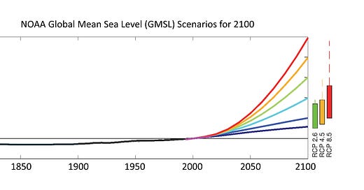
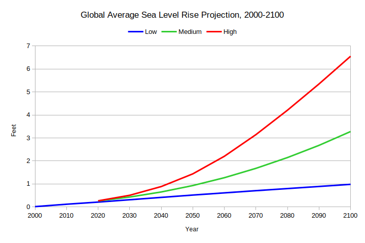
Average sea level rise needs emphasis because of geographical variation. Sea level is currently rising by about 1/7 inch per year, to a total of about a foot from 1880 to 2020, according to the Sea Level Rise Interagency Task Force, including NOAA, NASA, the EPA, and USGS. For 2100 they project three possible total average sea level rise from the current level: 1 foot, 3.25 feet, or 6.5 feet.
A rise of about 8 inches before 2000 means our coastal infrastructure was partially compromised prior to the range in the graph below. Most of the world’s coastal infrastructure was built or planned before 1950 with the assumption of no rising sea level, and the 2012 effect of Hurricane Sandy was the devastating result.
The task force provided a valuable service in indicating three outcomes for 2100. However, the shape of the graph getting to these numbers is critical:
The “L” graph looks like it is close to having an inflection point, meaning it will become concave downward early next century. Thus, in the last half of the 21st century it would be possible for the amount sea level rise return to fractions of one inch per year, as in the 20th century.
In contrast, the “H” graph has increasing exponential growth, meaning we may have reached a tipping point, and the Greenland ice cap may be gone within the next century, with a sea level rise of 20 feet by 2200.
If these shapes were reversed, they would tell an entirely different story.
2. Preventable Methane Leakage
Methane has about 50 times the effect on Global Warming and is responsible for about 50% of it. Most of the preventable methane leakage is the byproduct of inadequate production procedures by the oil and gas industry. The amount is small compared to using fossil fuels for energy, but is more preventable.
This graph should help to apply political pressure on governments to compel the oil and gas industry to spend a small fraction of their profits on stopping this leakage:
100% represents the year 2000’s level of leakage.
The hypothetical “H” graph indicates the petroleum industry’s continued greed, in not significantly helping to reduce Global Warming. In the 1950s this industry helped dismantle the electric trolleys and electric buses in many metropolitan USA cities. Millions had shorter lives due to diesel buses. Even though industry scientists were the first to understand the extent of Global Warming due to their products, in 2003 they killed GM’s EV1 (an innovative electric car introduced in 1996) after Al Gore was not elected President in 2000.
The hypothetical “L” graph in contrast is about the best we can hope for only if countries bring the petroleum industry to its knees.
3. Earth’s Habitable Capacity
For thousands of years, the Earth’s Habitable Capacity for humans has been mostly expanding. (However, in the last half of the 1800s, the agriculture of Europe became incapable of supporting its population.) This led to millions coming to the U.S. and the Western Hemisphere.
In contrast, now Climate Change is causing a sustained decline in Earth’s Habitable Capacity. Floods, droughts, forest fires, and hurricanes are a few causes. A sizeable portion of immigration into Europe, the U.S., and Canada result from other regions’ inability to support their populations. In some cases, these are “failed states.”
This will likely be the hardest for scientists to derive three alternatives because of all the variables involved. The main variable is what would be an “expected” average standard of living. Do we want the world’s economies to continue to be dependent on a large percentage of humans remaining in poverty to serve the needs of the rich?
That variable aside, why else are my guesses of sustainable population so low?
Because humanity is consuming and polluting Earth’s resources as if there is no tomorrow, much less a day after tomorrow. Let us name just two of them.
Fresh waters, aquifers, ground water, and glaciers: All of these are being depleted with no thought of the future or their economic value. Some will never recover. Himalayan glaciers supply water for billions of people.
Farmlands, bad farming, erosion, and urban sprawl: Farmland and its topsoil have declined in quantity and quality. More fertilizer has to be used. Fertilizer production requires lots of energy.
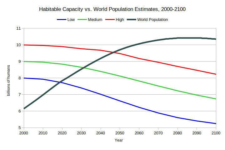
Accordingly, all three graphs show a decline from 2000 given the hemorrhaging of people all over the world due to Climate Change. Each graph will need to begin to level off as the Earth’s Habitable Capacity becomes more in balance.
4. Population
The following is the U.N.’s demographic data for the world’s past, present, and future as of 2022:
Note this data is updated regularly as more information is obtained.
Habitable Capacity vs. Population
For this graph, the M for Capacity crosses the U.N. Population Graph around 2030:
What is likely to happen after these curves cross? The longer the time after they cross, the more suffering and death will likely occur. Also, because of this, the future U.N. predictions will need to be significantly revised downward.
Overpopulation is a reality, if not now, then clearly before 2100. If we don’t voluntarily take steps to curb population growth, we will suffer involuntary population decline.
Please Have at Most Two Children
This is the prescription of many articles on this website. As opposed to the 1960s and 1970s, the emphasis is on please.
There needs to be a campaign to help people understand this simple concept: Each person being responsible for at most two children is better for the children’s success as well as the sustainability of humanity.
If adapted, how will this work? Although the population will continue the rise for decades, given many people are responsible for just one child or none, the world’s population will eventually peak and begin its decline sooner than the current forecast.
3 Numbers for the Long-Term Population Sustainability of Humanity
My hypothetical estimates are:
High: 7 billion (2011)
Medium: 5 billion (1987)
Low: 3 billion (1960)
(The years indicated above are when the world’s population first reached these levels of population, more than doubling between 1960 and 2011. A net difference of 51 years is well below a human’s life expectancy!)
Once determined and publicized by scientists, these estimates hopefully will be of shock value for humanity to change course.
Inevitability of Sea Level Rise
I return to this first theme because it will have a detrimental effect on all other concerns. Whatever sea level rise occurs, it will likely be irreversible for centuries.
SCIENTISTS, FOR HUMANITY’S SAKE, please produce the SPECIFIED GRAPH IN 2025 and have it “published” widely!
A proposed standard graph already exists in various forms from various agencies. These agencies need to come to a consensus and annually distribute an updated graph on a day in the spring designated as “Sea Level Rise Day.”
Does humanity want a reasonably “pleasant” future for this century, to say nothing of the following centuries? If so, we need to stop multiplying like rabbits, or like goats on an uninhabited Galapagos island.
(Unfortunately, this condition is only necessary. Given all of humanity’s other problems, it is far from sufficient.)


